3.2 按钮
Material 组件库中提供了多种按钮组件如ElevatedButton、TextButton、OutlinedButton等,它们都是直接或间接对RawMaterialButton组件的包装定制,所以他们大多数属性都和RawMaterialButton一样。在介绍各个按钮时我们先介绍其默认外观,而按钮的外观大都可以通过属性来自定义,我们在后面统一介绍这些属性。另外,所有 Material 库中的按钮都有如下相同点:
- 按下时都会有“水波动画”(又称“涟漪动画”,就是点击时按钮上会出现水波扩散的动画)。
- 有一个
onPressed属性来设置点击回调,当按钮按下时会执行该回调,如果不提供该回调则按钮会处于禁用状态,禁用状态不响应用户点击。
3.2.1 ElevatedButton
ElevatedButton 即"漂浮"按钮,它默认带有阴影和灰色背景。按下后,阴影会变大,如图3-6所示:
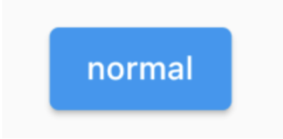
使用ElevatedButton非常简单,如:
ElevatedButton(child: Text("normal"),onPressed: () {},);
3.2.2 TextButton
TextButton即文本按钮,默认背景透明并不带阴影。按下后,会有背景色,如图3-7所示:
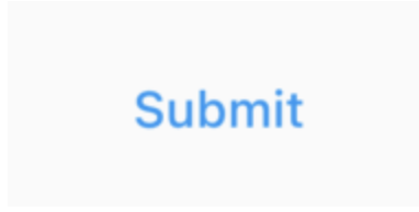
使用 TextButton 也很简单,代码如下:
TextButton(child: Text("normal"),onPressed: () {},)
3.2.3 OutlinedButton
OutlinedButton默认有一个边框,不带阴影且背景透明。按下后,边框颜色会变亮、同时出现背景和阴影(较弱),如图 3-8 所示:
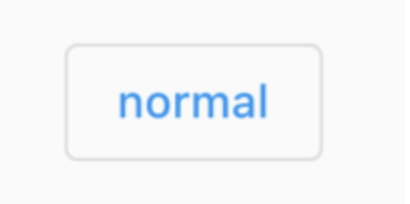
使用OutlinedButton也很简单,代码如下:
OutlinedButton(child: Text("normal"),onPressed: () {},)
3.2.4 IconButton
IconButton是一个可点击的Icon,不包括文字,默认没有背景,点击后会出现背景,如图3-9所示:
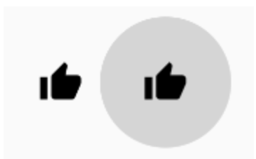
代码如下:
IconButton(icon: Icon(Icons.thumb_up),onPressed: () {},)
3.2.5 带图标的按钮
ElevatedButton、TextButton、OutlinedButton都有一个icon 构造函数,通过它可以轻松创建带图标的按钮,如图3-10所示:
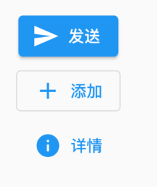
代码如下:
ElevatedButton.icon(icon: Icon(Icons.send),label: Text("发送"),onPressed: _onPressed,),OutlinedButton.icon(icon: Icon(Icons.add),label: Text("添加"),onPressed: _onPressed,),TextButton.icon(icon: Icon(Icons.info),label: Text("详情"),onPressed: _onPressed,),